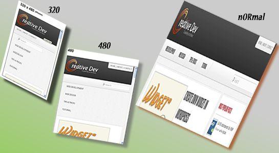
Before few days back, one of my friend asked me that how to build responsive layout and I just replied him that my blog is responsive and even I have worked with many websites’ responsive layouts, you can have a look into devices and. you can see CSS into it to develop responsive layout.
Still My friend was confused and not got much idea how to develop responsive layout so today I am going to explain steps to show you the basics of responsive design for any website work with device orientations which detect the type of device and change the site’s behavior accordingly.
So, Let’s go through the steps
Step 1:Include the Viewport
First of all, add below meta tag into your < head > tag.
1 2 3 | <meta name="viewport" content="width=device-width,initial-scale=1.0"> |
This is a most important meta viewport tag to set the correct scale of a website in devices.If it’s not added, responsive layout may suffer from some issues like fonts not matches with the design.
Step 2: Add Media Screen
Next, Add css link with media=”screen” into < head > tag which is shown in below code:
1 2 3 4 | <style type="text/css" media="screen"> </style> |
It’s used to allow part of CSS rules to the specific devices on the specific configuration.
Step 3: Media Queries
CSS3 media query play the main role for responsive design.CSS3 media queries are one kind of conditions to figure out what resolution of device orientation it’s being served on the browser.
So Here, I am going to explain most used media queries are:
- 320px – iPhone Portrait
- 480px -iPhone Landscape
- 768px – Ipad Portrait
- 1024px – Ipad Landscape
- 1200px – Normal views
Let’s see Breakpoints we need to put for most used media queries.
1 2 3 4 5 6 7 8 9 10 11 12 13 14 | /* Media Queries for iPhone Portrait */ @media only screen and (max-width:479px) { } /* Media Queries for iPhone Landscap CSS */ @media only screen and (min-width: 480px) and (max-width: 767px) { } /* Media Queries for iPad Portrait */ @media only screen and (min-width: 768px) and (max-width: 799px) { } /*Media Queries for Normal */ @media only screen and (min-width: 1024px) and (max-width: 1200px) { } |
Here, I have explained basics about responsive layout but You can write as many media query as you like. If you have the option of testing on multiple mobile devices, you can test it into mobile devices or if not,you can check responsive layout on this site.
I hope this post was useful & it has helped you to create responsive design for your website.Thanks for reading and feel free to share your thoughts! Don’t Forget to Follow us on Twitter or Subscribe us to Get the Latest Updates.


