Recently I came across the very interesting property of css3 and its uses for sizing elements.This morning I spent some time investigating object-fit in CSS3 and here I am going to share my experience with you.
The object-fit CSS property defines how an element should fit the width and height of its content box.It is mainly useful for images, videos, objects, SVG content element in HTML.
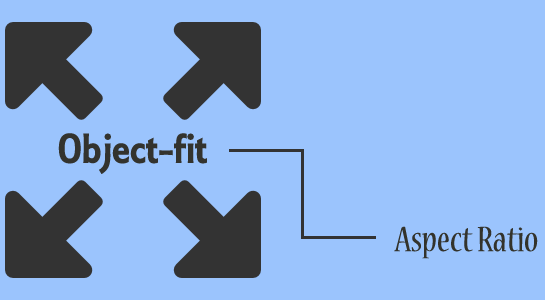
If the page has to be something like a grid of images and pictures of different sizes, the property object-fit provides a simple and elegant solution.Without object-fit dimensions are set like only one dimension (width or height) at a time that the second calculates so you can at least maintain the aspect ratio.
object-fit Options
object-fit include following options
1. contain – To shrink or enlarge itself until it fits in the box while fit according to aspect ratio.
2. fill – stretches object to fill the entire box and ignore its own aspect-ratio.(default). It fills the area proportionally
3. cover – To shrink or enlarge itself but maintains aspect ratio.
4. none – It ignore the height and width of the parent and maintain correct aspect ratio.
5.scale-down – To compare the results of none and contain and choose the one that results in the smallest image.
Formal syntax:
Here is the syntax of object-fit CSS property
1 2 3 | object-fit: fill | contain | cover | none | scale-down |
Read about: CSS3 Gradient Effect
Initial value: fill
Applies to: Replaced elements
Inherited: No
Animatable: No
CSS Version: CSS3
Example
1 2 3 4 5 |
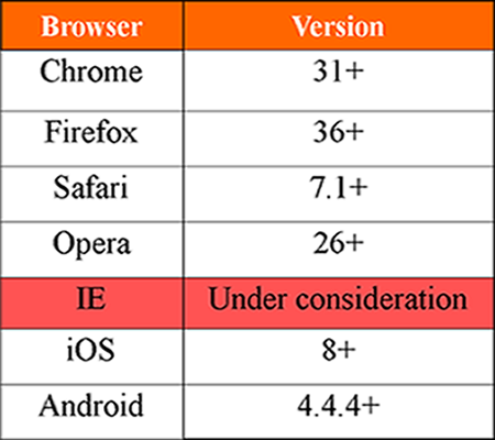
Browser Support

We hope this article helps people to understand the usage of object-fit.It’s pretty cool stuff, and I’m sure there’re tons more you to know about the css3 property. If you know any other property of CSS3, please share in the comments 🙂


